Google tests carousel local pack with ads included
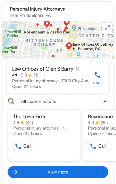
Google has been testing a new design for the “local pack,” the local results box in the search results. This new design shows the local results in a scrollable carousel format and now also includes an ad spot at the top.
What it looks like. Mike Blumenthal posted about this new design on his blog, he has been covering these scrollable local packs for the past couple months now. Here is a screen shot not just showing the carousel format, but also the static, non-scrollable, ad spot above the carousel for organic local listings.

What it normally looks like. Here is a screen shot of the normal interface, without the carousel.
Why we care. The local pack in this new carousel format is a lot more interactive and by default only highlights one-and-a-half local results on first glance. To see more results, you need to scroll through the listing and then when you click on a listing, you get other options. Mike Blumenthal wrote a nice detailed piece on why you should be worried about this scrollable carousel format for the local pack, it is worth a read if you do local SEO.


