Font Design 101: The Process of Creating a Type
Rules. Embrace rules, as they can define a new font-making project, give it guiderails and keep the new type on a specific trajectory. Even in such a creative process of designing new type, the technical nature of crafting a font requires a mixture of art and plenty of well-guided science, all while building new and solving problems.
Hitting the Books Is the First Step
Before a font designer can tackle a new design, they must first settle on that problem to solve. Fonts generally get created in one of two avenues, either speculative based on the whim of a designer or to fit a specific client need.

No matter the genesis, research kicks off every project. “You need to have a sense of what things have been tried and what you can learn from,” says Ben Kiel, co-founder of XYZ Type.
“The research can also include usage,” says Kiel. “If it is client-focused it can be easier because the answers are there. You are setting up a set of metrics or guideposts for the design.”
Having usage and a client define the guideposts give a narrower design road to travel, often making decisions easier.
“It is a text typeface or display, will it be used large or small, does it need to look good here or there?” Kiel asks. “There are a bunch of things a type needs to do.”
Function First and Setting the Rules
Miguel Reyes, former graphic designer turned font designer for Commercial Type and now based outside of Mexico City, says he still thinks like a graphic designer and tries to find what holes the font needs to fill. “It is not just about the aesthetics,” he says, “it is more about functionality.”
All along the design process, says Jesse Ragan, co-founder of XYZ Type, questions will pop up and having a clear brief of the goal of the font creates limiting factors and helps frame those questions to more easily find the answers.
A Sketching Start
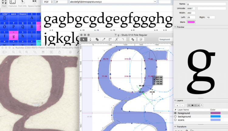
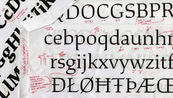
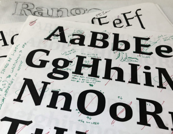
With the rules set — some designers make them stricter than others — the sketching can start. Reyes says he almost exclusively works digitally to save time in not remaking hand drawn sketches.
With a few different approaches to the same question, designers create an initial form and then really start pushing the boundaries to see what the most extreme version of the type could be. “You want to explore and go too far to know where the limit is,” Kiel says. “If you don’t go too far in the initial phase, you don’t know what could have been. You need to have a visual reference of what is too much.”
The drawing of letter forms starts small. Ragan says he chooses common characters, such as the lowercase “a” or “g” or a capital “R,” all containing plenty of personality. “I mix in complex and potentially strongly voiced characters along with more straightforward, rudimentary shapes, such as a capital “H” and “O” to help build a strong foundation,” he says, “and give a basic rhythm so I can build more expressive characters around them.”
Reyes starts with a similar concept, choosing a handful of characters to get started. But he quickly moves into entire words to see the connection. “I feel there are words that will give you the whole DNA of a typeface,” he says. “I try to use real words related to the brief.”
Limited Character Sets
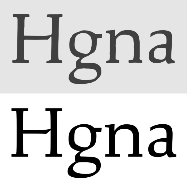
“You have to work with a limited character set at first to work quickly,” Kiel says. “If you try to do a set of upper and lower you get bogged down in production. You are picking a set of characters that you can make some proof documents, even to get a couple of words to get texture and rhythm. You are exploring with a limited set before you expand to a full set.”
Ragan says momentum really takes over once he starts designing, so answering the bulk of questions early helps later. “If you resolve the questions when you only have 15 characters, you save yourself a lot of trouble when you have eight different weights and three Romans and you change your mind you have to go back and change the drawing for 200 characters,” he says. “That said, I always end up doing that, but I want as much of that minimized and contained.”
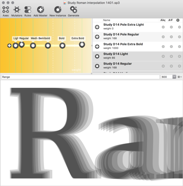
Also interested in exploring the extremes, Reyes will bounce around his design in differing weights to see the range of his design and determine early on how the characters are going to work together.
Limited character sets early also allows for the flexibility to fail. “If it looks good in thin, but not in black, you’d rather find that out sooner than later,” Kiel says. Plus, you may find that one weight influences another and the idea of how to handle italic may improve the Roman.
With or Without a Client
This process, while the most creative and most defining of the font creation also offers the most open-ended in terms of timing. Having a clear client relationship can help keep that timing focused. “Some people really like having clients and some people work better without,” Kiel says. “I think I work better with a client because I get lost in the decision process. I will keep doodling and not make a decision. Having a hard deadline is always helpful.”
In the Thick of It
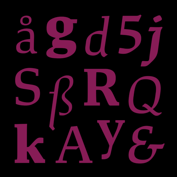
Key decision points in any font project comes in how heady are strokes, the contrast between the thickest and thinnest part, how round the rounds are and how square the squares. Then more specifics get into shape, structure and spacing. All along the way, designers work to create a texture and tone to the font, defined largely by guide rules set early. How wide, how narrow, how heavy, how contrasted, how tall, how do the proportions work?
“You are making those larger decisions early on,” Kiel says. Then comes nailing serifs, small details and the minutia. Whether the shape of ball terminals, if the font even has them, and the relationship between differing parts of the family. Does the way the top of the “3” terminate match a lowercase letterform? What about the leg of the capital “R” versus the leg of the lowercase “k”? How do those relate? “Figuring out what that system is tends not to be modular,” Ragan says. “How do I make things fit together in a way that makes sense and still has variety? That is where decisions are being made in sense to the needs of each individual character.”
All those decisions must serve the ultimate goal. If a branding type, does it express something about the brand? If it is display, does it mimic someone’s lettering style? If a text type, does it come together to make it easy to ready but not so boring that someone falls asleep? “The nice thing about having a client is they will generally have strong reactions to the details,” Ragan says. “It is nice to have another voice. You get a little deep in your head sometimes.”
Production Pointers
Typeface design front-loads the creative process, but that may only end up being a small percentage of the time dedicated to making the font. The major portion is figuring out production. But, as Kiel says, if you don’t have the design thinking momentum to carry you through production, you can end up with subpar work.
Reyes puts it bluntly: “Once the creative process is done, once you are sketching and get the idea, which is the fun part, when you nail it, it becomes a bit boring,” he says. “The rest of the project is a bit more mechanical. Now you need to feel things. For me it is not super fun, but it needs to be done.”
Ragan admits that sometimes he starts second-guessing himself late in the production process, partially because “my brain starts trying to problem-solve and wants the fun part of figuring out the design” instead of the monotony of building hundreds of character forms.
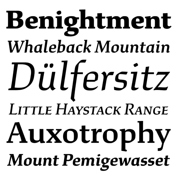
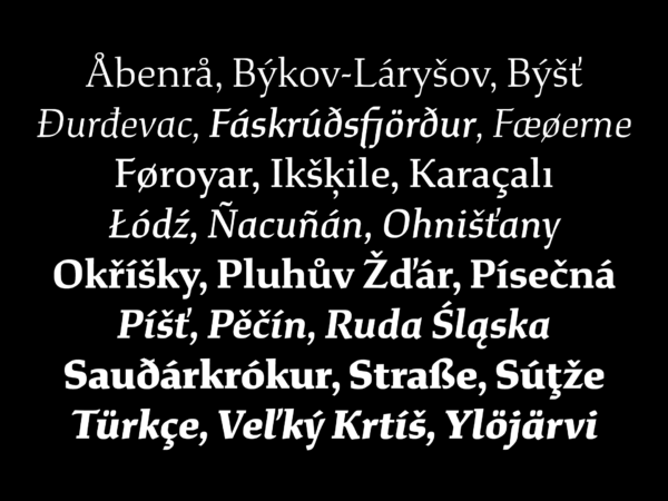
With as much as 350 to 400 characters per basic typeface — the XYZ Corado has 1,200 characters and their brand-new type, Study, comes in 12 different styles — the production process takes that kit of parts, that tone earlier derived and applies it across weights and widths.
The Same Eye
Then comes the kerning and mastering. Reyes says that even though the building and polishing isn’t the most exciting aspect, he thinks it imperative for the consistency the same person sticks with a project from creation to mastering.
Ragan likened it to large architectural firms who have someone come up with the big idea and then others who have to go in and figure how to practically make it happen. He agreed that for something as complex as a typeface, it is easier for one person to handle every step so they understand how all the parts interact.
“For me it is super important that the same designer do most of the work,” Reyes says. “They can balance the whole process. What I learned drawing and spacing is part of the design, not a separate thing. Even though is it not fun, I need to do it by myself to make the project much better.”
The Most Intense Parts
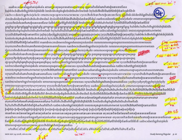
That kerning step offers up one of the most time-consuming aspects of the process. Often manually kerned — a little-known fact, Ragan says — the designer figures out every plausible combination of glyphs. “From the question mark to the em dash or the number sign to a letter and a number,” Ragan says, “I haven’t stopped to count how many kerning pairs need to be reviewed.”
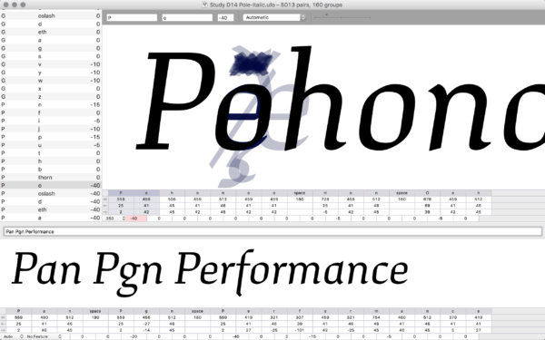
This, Reyes says, comes as the most critical aspect. “There are parts that are great on the shapes and if the spacing is badly done,” he says, “it falls apart.”
Final Stages
With the questions answered, drawings done, characters created and kerning devised comes the final step. Fonts must live digitally and work within a wide range of software, so the mastering process takes all that creative and design data and gets it into a final form where it works with Microsoft Word and other programs without technical errors. “There is a long list of technical requirements to make something work well across operating system and software packages,” Kiel says. “The mastering process is going through and checking all that so you end up with something that works for the end user.”
After thousands of hours put into a design, it all boils down to small bits of data in the end. But to get to that data requires an exceptional amount of detailed creativity, all falling within a set of type-design rules.


