Tips for Making the Most of Your Content-Heavy WordPress Website
A website should be designed around the needs of its content. So, the look and layout you might use for a standard brochure-style site won’t necessarily work as well for a site that features lots of news or products. Different types and amounts of content can greatly affect your design strategy.
Sites that are “content-heavy” are especially unique. They have to be designed in a way that is clearly organized so that users can easily find and identify pieces that are of interest to them. But, when building such a website, you’ll also want to ensure that you can draw significant attention to specific items that you want to showcase, as well. And it all needs to be wrapped up in one attractive and flexible package. It can be difficult to find the right balance.
One tool that really makes the task easier is WordPress. The content management system excels at helping you organize vast amounts of content in a logical way. Combine it with the right theme and you’ll have a website that is both beautiful and user-friendly.
Today, we’ll take a look at some tips for making the most out of your content-heavy WordPress website. Along the way, we’ll point out some excellent WordPress themes that are available with your yearly subscription to Envato Elements. It’s home to more than 500 premium WordPress themes and plugins, along with unlimited access to more than 550,000 digital assets.

1. Use Color, Images, and Whitespace to Create Separation
If you’re running a busy blog or news-oriented website, the chances are you’ll want to display links to several posts on your home page. But that can lead to clutter and confusion for users. To make things easier to follow, use a layout that provides adequate whitespace between items. You might also consider adding featured images and a small splash of color, where appropriate, to make each article both stand out individually and fit into the larger context of your page.

Pressroom is a theme that provides an excellent example of these principles. Individual items are spaced out nicely in a well-organized grid. You’ll also find a very consistent use of color that helps the eye easily separate one article from the next. The featured images are nicely-sized to help draw attention without hindering performance.
2. Get Right to the Point
Websites that require users to take action (like searching or navigating to the next level of content) shouldn’t be shy about it. In other words, there’s no need for lengthy introductions or content that doesn’t let the user do what they need to do. Instead, you’ll want to provide them with the tools they need and make it the focal point of your design.

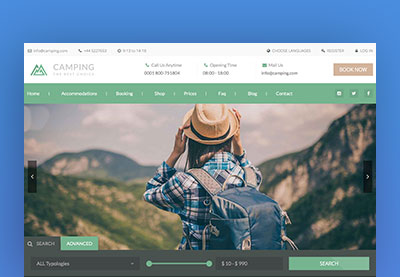
Directory sites fit into this category and the QuickFinder theme is one that gives users exactly what they need. The prominent map allows for immediate access to listings while the multi-faceted search bar lets users narrow or broaden the scope of their search as they wish. This is a great choice for business directories, job listings or even membership-based sites.
3. Show Related Content
Just enticing a user to click into one of your posts is a win. However, if you want to keep them interested beyond that single article, you’ll want to show a list of related content. This provides your readers with other items they may want to view. An effective use of this strategy can keep eyeballs on your site for longer periods of time and encourage repeat visits.

Oftentimes related content is relegated to the bottom of a post. What’s so refreshing about the PressGrid theme is that it places related content in a much more visible area. It can be placed in a “sticky” sidebar that stays in view–even as a user scrolls down the page. This may be a small detail, but it can make a big impact when it comes to keeping users on your site.
4. Make Good Use of Screen Real Estate
Today’s websites have to be pixel-perfect on anything from a small smartphone all the way up to a huge 4K monitor. For sites with a lot of content, it makes sense to take advantage of whatever amount of screen real estate is available for a particular user. If arranged in a neat and organized manner, you’ll be able to show off your content effectively–regardless of screen size.

Passion Blogger is a WordPress theme that makes full use of whatever screen it’s being viewed on. One of its best assets in this area is a full-width set of featured posts that utilizes a simple series of content blocks, rather than the more traditional home page slider. This allows more content to be shown on larger screens, while stacking nicely on smaller ones.
5. Don’t Be Afraid of Unique Touches
When you have a lot of content to fit into a limited space, it can be very tempting to utilize a somewhat-vanilla grid layout. But it’s quite possible to do something that both looks unique while not necessarily breaking the mold in terms of layout. This is an area where applying some CSS can be of great help in making your layout look bold and attention-grabbing, while still being easy enough to maintain.

One category that really benefits from this brand of uniqueness is eCommerce. Mall is a theme that offers it up in an attractive, yet subtle way. Sure, it uses a grid layout. But the use of interesting shapes, coupled with varying amounts of borders and spacing result in something that looks anything but run-of-the-mill.
Bring Your Content to the Forefront
A website with a lot of content is one that has a lot to offer its users. The key is in designing your site to take advantage of that depth.
Ideally, your design will be well-organized, easy to navigate and provide each piece of content with its own chance to shine. But it’s important to keep the goals of your site in mind, as well. That means providing users with the tools they need to take action and using techniques that will entice them to stick around for awhile.
Last but not least, utilize a design that is both unique and fits your brand. It really is crucial to the user experience that you’re trying to build.
Content-heavy websites can be challenging to design for, but having the right WordPress theme in place can have you off to a running start.
Building a WordPress Website?
Here are some more useful tips for you: